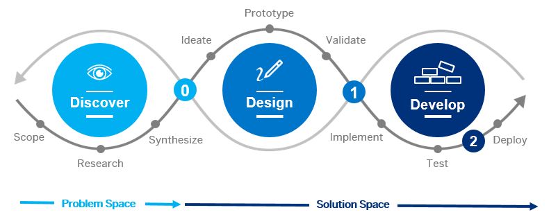
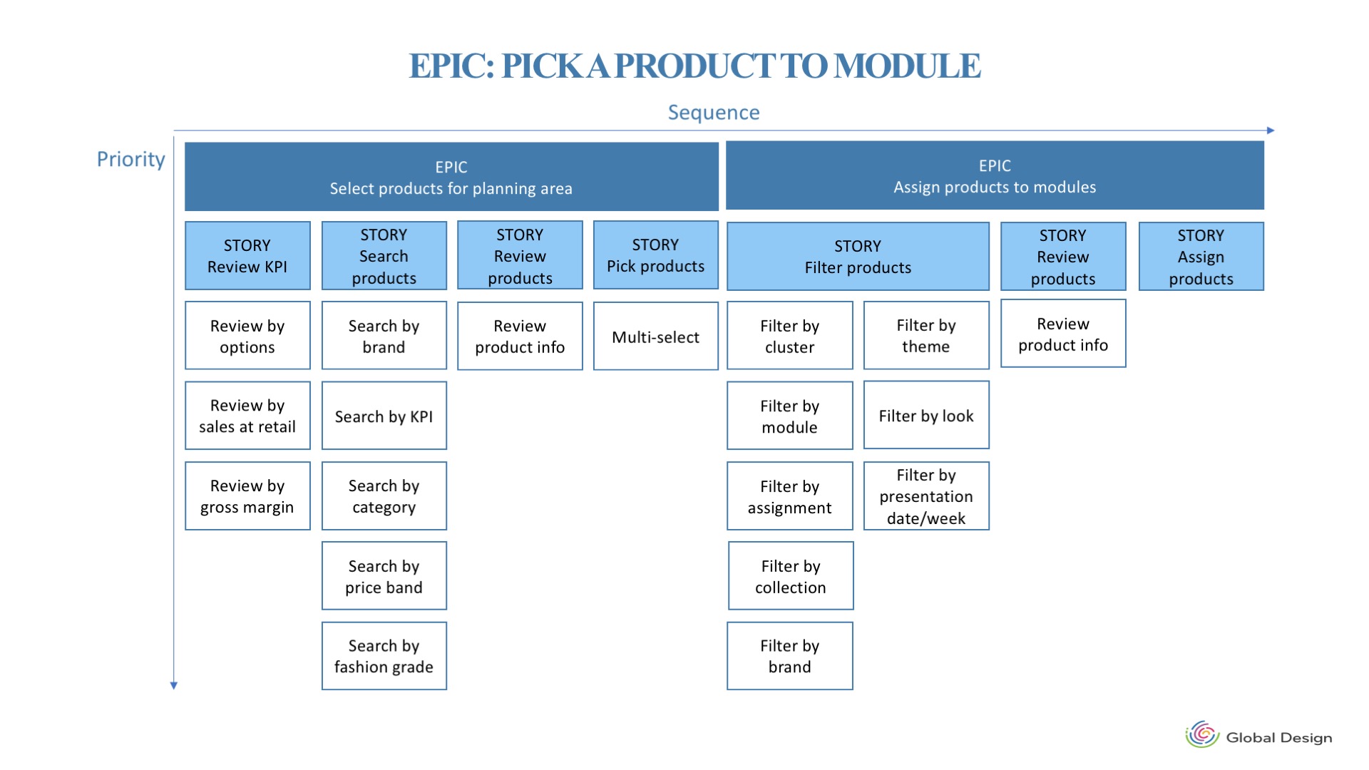
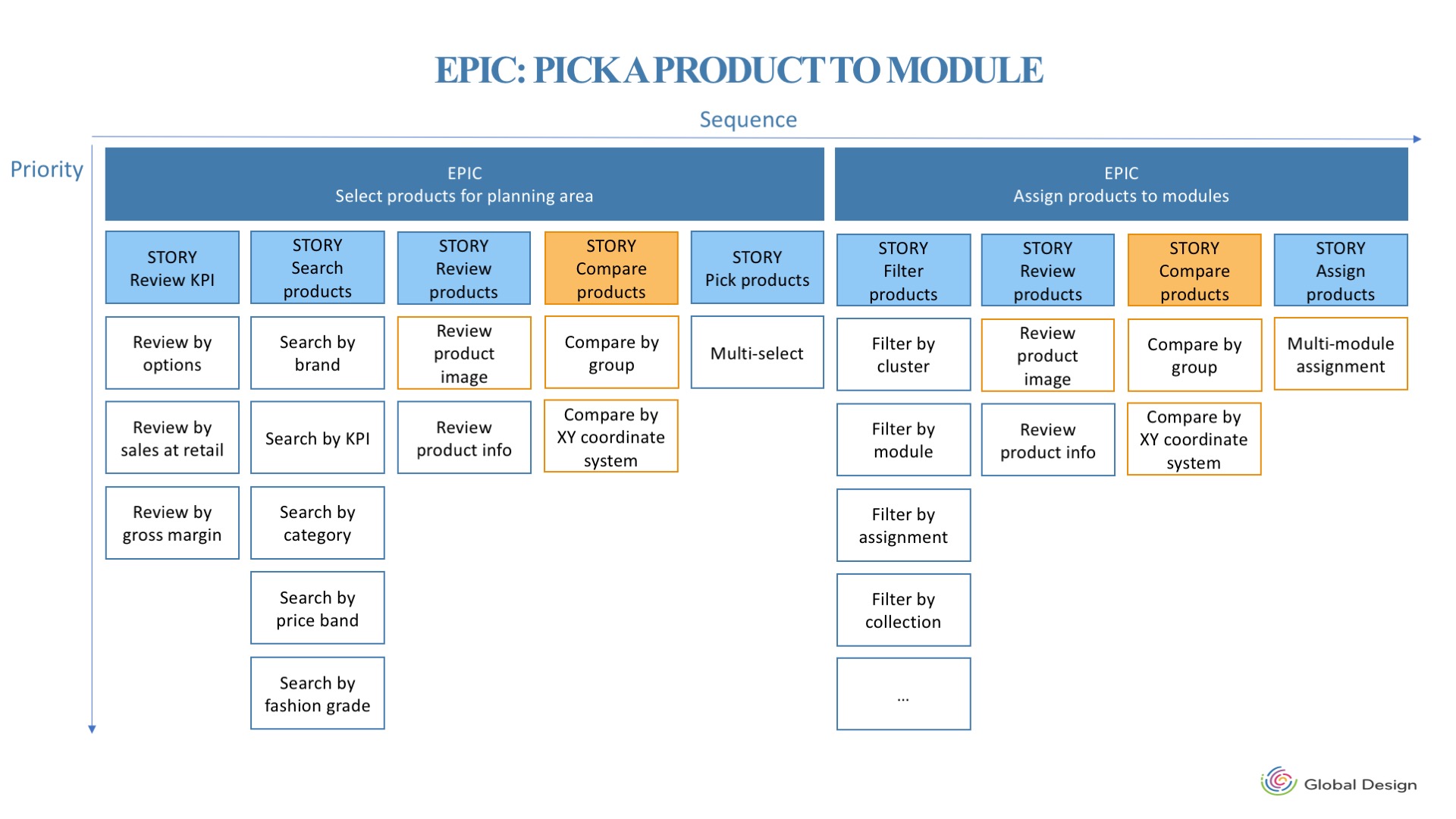
We used User Stories framework to walk through the scenario of picking and assigning a product into modules in our current system. Combined with our findings about users’ pain points in the discovery phase, we identified the gaps between users’ desired functionality and our current system. Then we updated the user story map to manage our new features.
Pain Point 1. Cannot select and assign products visually.
Pain Point 2. No powerful visual system to compare products.
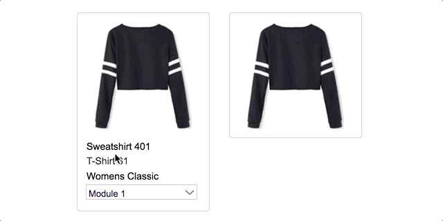
Product Image View
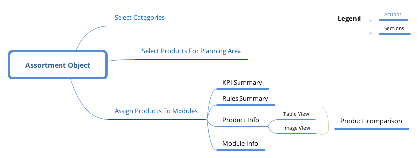
To nail down all the information sections that needs to be included on the assortment object page, I personally created the flow chart to help me decide the importance and priority of different sections.
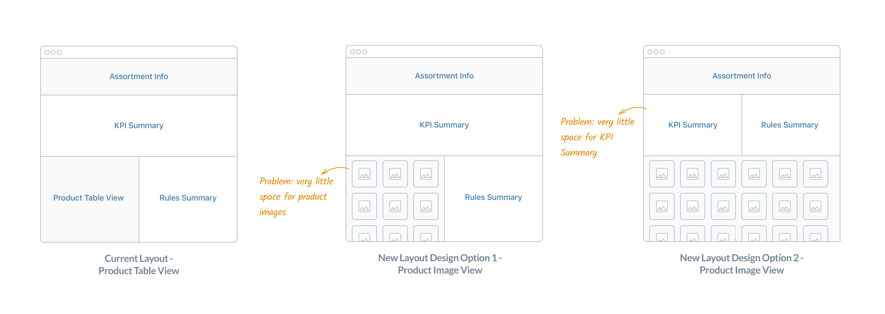
The first design challenge I encountered was to use the limited screen space to allow users to see all the information they need to finish their task - assigning products into modules. As soon as I finished the first iterations of wireframes, our team had a qualitative test with five end users to validate the design solutions.
“I would like to use all the screen spaces to review and compare all the products.”
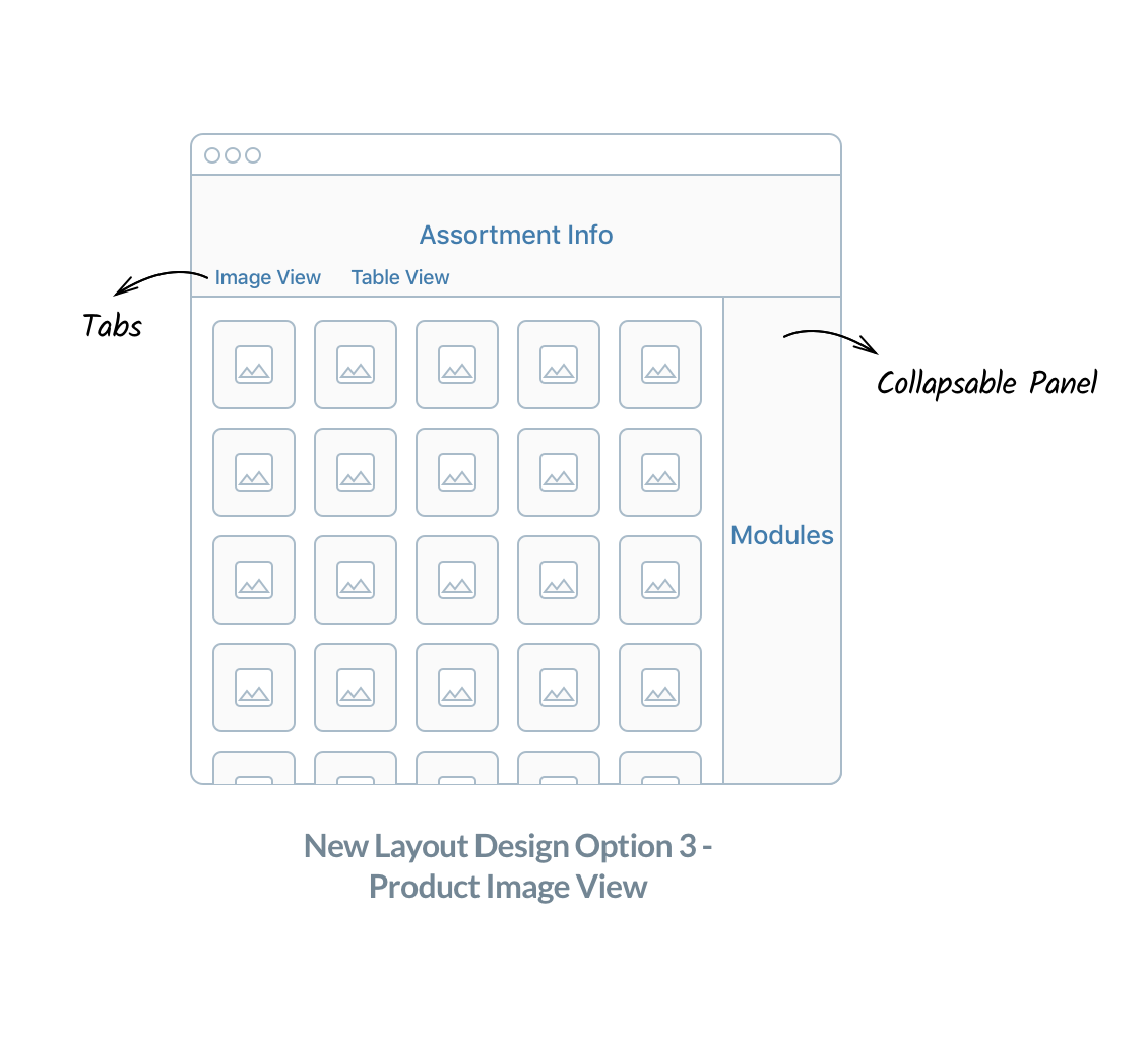
5/5 testers told us that they spent 95% of their time in product table/image sections and would need a workspace only to review as many items as possible, while the KPI and rule summary were only necessary to check when they made updates. And as a result, we kept the KPI and Rule Summary sections in table view and remove these two sections in image view.
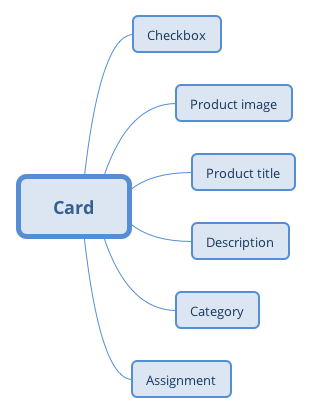
Responsive Card Design
Responsive card has been a popular way to present personalized digital contents. In our application, we decided to present product information (images, categories, etc.) in the form of digital cards.
To design the cards, I started with summarizing different information I need to include on the card. Then I prototyped different versions to generate feedbacks among teammates.